UX Case Study : FFCS on the go redesign
--

This is a case study based on the work that has been done as a project work during my Human Computer Interaction (HCI) course under Prof. Thenmozhi T in Vellore Institute of Technology, Vellore. I will talk about how I redesigned FFCS on the go platform by finding the problems and fixing them.
What is FFCS?
FFCS — Fully Flexible Credit System is a system that VIT proudly boasts about in every brochure or advertisement that this is a system that allows students to choose their own faculty, subject, slots, class timings and venues. Obviously, now it might seem very easy but actually things are tougher while implementing it. The name fully flexible credit system might mislead you to think the credits to be arranged by your own(within a subject). But, that’s not the case. It means they provide you with a certain amount of specified credits and you get to choose the subject with that number of credits and add it in your courses. Apart from this making sure there are no slot clashes, no blacklisted faculties or no mixed slots, one has to plan his timetable before the FFCS day.
All in all it’s a huge pressure planning out a perfect timetable specially when the FFCS servers are online only during the D-day. That is why FFCS on the go was made in 2016 to make FFCS planning easier for the students. But it was never updated all this while. I have been a user of the platform for 2 years and I thought the upgrade was necessary at this point.
Link to the existing website — https://ffcsonthego.vatz88.in/
Research
I carried out the research phase in two parts.
- First I did the heuristics analysis of the existing website using Neilson’s 10 design heuristic.
- Then I carried out 5 user interviews over google meet due to the pandemic to understand the user problems even better.
I did not feel the need to make a user persona for my understanding because my volunteers were my seniors and freshers from college who I already knew.
Problems identified
- The project has a very simple interface in which different blanks are provided for the different purposes but the alignment of the different form fields are not according to any kind of logic which is why at times, there is a general confusion for finding any particular functionality at the correct place.
- The first time the user looks at the interface, it is difficult to convey the main functionality of the website because there is no prominent Hero section in order to highlight the features and the capability of the project.
- The user elements are stacked in a way it increases the cognitive load for the user and everything is presented at once. In this way the user is overwhelmed at the first appearance of the website and this has to be avoided by segmenting the website into different parts or sections.
- When there is a possibility for the clashing of the courses because of the overlapping on the courses, the indication for this particular issue is not so prominent which is why the user continues to choose the courses even when the courses are clashing because they have to manually query about the flashing by scrolling down to the area where the time table is being shown.
- Another major problem that was noted during user interviews was that there is no personalization involved in the current version. By that they meant the website would still show them subjects that they have already completed as an option. But they still were not comfortable with signing up.
Solution
I will give you a tour of my case study and explain how I managed to solve the above mentioned problems and enhance the overall user experience at every stage.
I decided to split the platform in 4 web pages namely the home page, comments page, credits page and the FAQs section.
The user flow and the wireframes of the redesign are as follows.


The User Interface
All the changes were made after closely considering the outcomes of the user interviews and the feedback loops that were carried out throughout the process.
- An organized header for the website that lets the users understand the platform even better and also gives a brief introduction to the functionalities that are present.

- The slot clashing is a major issue that students face during FFCS. To avoid that in this version I made sure the selection of the same slot subjects is not possible itself, as I implemented a color change on hover if any subject already exists in the same slot. The color changes to red as to alarm the users that the action is not possible.
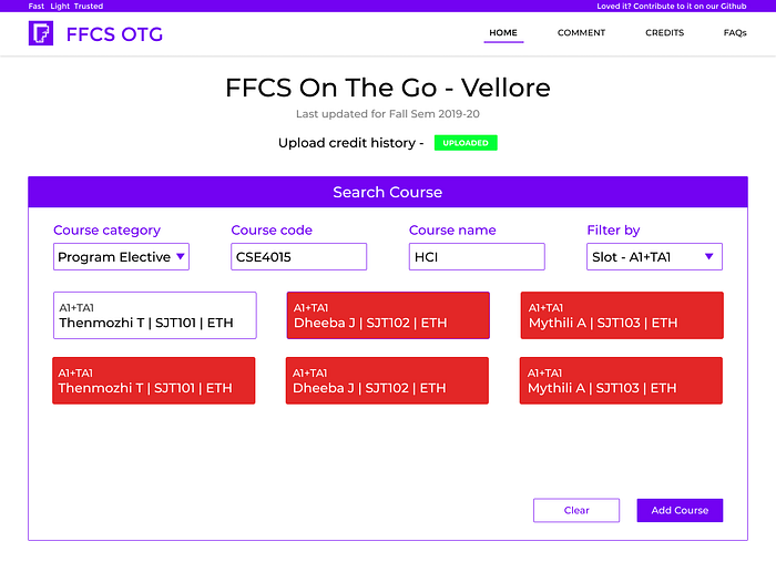
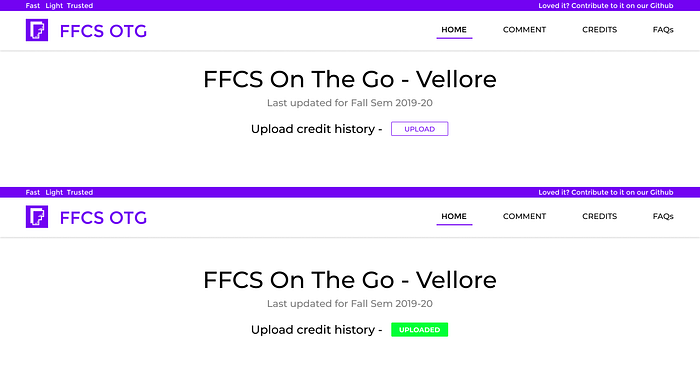
- To tackle the problem of completed courses being offered as an option, I introduced a “Upload credit history” option. This list is easily available on the college’s student website. Although this is not a compulsory option as a few were resistant on uploading their credit history. This helped us not only stop the platform from showing completed courses as an option but also gave us another functionality.
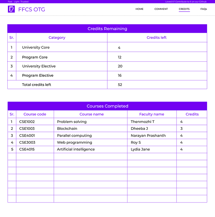
- The new functionality that the credit history upload allowed us to implement is the display of remaining credits to be completed. This helps the students immensely while planning their timetable as certain number of credits are compulsorily meant to be done from the electives and core subject list.
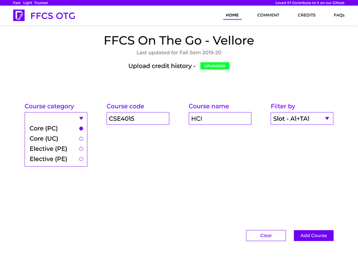
- A small issue that the users faced after this was identifying which course was offered under elective and core. To get that trouble off their shoulders, I added a drop down option of choosing the course category from electives and cores.
Another useful feature here is users can just select the course category and leave the rest of the options empty to get a list of courses offered under that category!
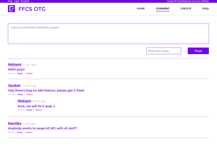
- The users complained that the comment section was often crowded and wasn’t really as fruitful as they thought because the UI looked too cluttered. So I decided to make a new page for the same. This was very crucial for us as well. Since we’re students, regular testing and finding bugs is a difficult task to do, but this comments platform ensured us that if there’s some issue with the website then the users can directly let us know through the comments!
- I introduced a FAQ section as well that had general information about FFCS and how to use the platform step by step for the freshers and any other new users.

Validation Testing
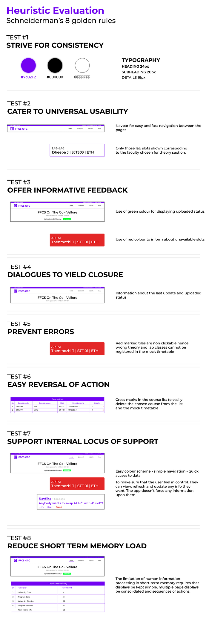
I carried out a heuristics analysis using Schneiderman’s 8 golden rules for the new UIs.
That’s all
Thank you for taking out time and reading this case study. I know that this case study is far away from being perfect so any feedback or suggestions would be highly valued. Feel free to reach out to me on LinkedIn or Twitter.
It would be amazing if you could give 50 claps to the article. Click/Tap and hold the clap button for a few seconds and BAM!
